Yoo Dai: staying in Thailand without overstaying
Foreigners in Thailand have to know three things that are scattered across government pages, forums and agents: which visa fits them, what the immigration office wants on the day, and how many days are left on their stamp. Miss the date and you overstay. Yoo Dai counts the days, finds the visas that may fit with a checklist to the counter, and gives people a reason to open it every day: what’s on in Thailand.
Context
My own product, for foreigners living in or visiting Thailand
My role
Product designer and design technologist. I designed and built the apps, researched the visa rules and write the content
Built with
SwiftUI, WidgetKit, ActivityKit, SwiftData with iCloud, StoreKit 2 and Supabase
Status
Tested on TestFlight by people living in Thailand. Not on the App Store yet
In App Store reviewResubmitted November 8, 2026
See the app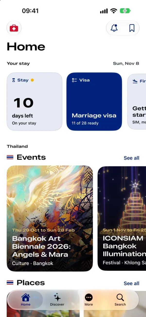
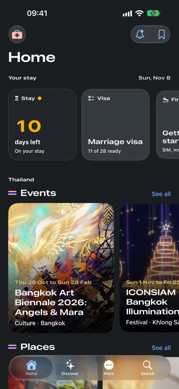
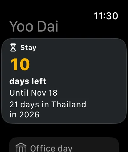
One made up stay in every screen: a New Zealand passport, 10 days left and a marriage visa 11 of 28 ready.
The date that matters most is the easiest to lose
Miss the last day on your stamp and you overstay, which means fines and can mean a ban.
The rules change often, offices differ, and most of what people read online is out of date or second hand. Which visa fits, what to bring to the counter and how many days are left all live in different places.
A visa tool gets opened once or twice a year, and a tool you open once is easy to forget. So the question Yoo Dai answers is two sided: how do you keep the date in front of someone every day, and when they do need a visa, how do you give them rules they can trust?
places show the days left: Home, a Home Screen widget, the Lock Screen and the Apple Watch.
With reminders before the stay ends and before a 90 day report is due
official source and one checked on date behind every visa rule in the app.
A rule without them is held back as an open question
to count your days, answer the visa questions and use Safety. A membership adds the full visa plan and the content.
$19.99 a year or $3.99 a month, no free trial
ads and trackers. Passport and stay details stay on the iPhone.
Published content, member tips and notifications come from a server
What these screens show. The stay, the plan and the office day are made up for the screenshots, and the events and dates are examples. The photos are mine.
What the design had to work within
Most of these limit what an immigration app may claim, and how much one person can keep current.
It can’t give legal advice
Immigration officers decide, and the app says so where rules show. Every rule carries an official source and the date it was checked, or it’s held back as an open question.
Passport details stay private
Passport and stay details stay on the phone, in the person’s own iCloud. No ads and no tracking. Deleting what you sent removes the notification address from the server too.
App Review has to find every purchase
The membership screen needs each plan’s name, length and price with Terms and Privacy links, nothing can be a placeholder, and the reviewer has to reach every purchase. Two of these caused rejections. App Store Review Guidelines, 2.1 and 3.1.2(c)
Content can’t wait for a release
Events and news go stale in days. So they come from Yoo Dai Publish, a web tool I built and publish from, and reach phones without an app update.
One person does all of it
Designing, building, researching the rules and writing the content. Every feature had to be one I could keep correct and current alone.
Three decisions that shaped it
Each card says what I chose, what else I considered, and what it cost.
Open on discovery, not on the visa tool
What I chose
Home is a feed of what’s on in Thailand, with the stay and the visa as cards on top. The cards turn into status: “10 days left”, “Marriage visa, 11 of 28 ready”.
What else I considered
Opening on the visa questions, as the first scope did.
Why
People need a visa once or twice a year but live in Thailand every day. A reason to open the app daily keeps the countdown in front of them.
What I gave up
A content commitment. Someone has to publish every week, and an empty feed looks worse than no feed.
Count days first, sell the visa plan second
What I chose
The countdown, reminders and Safety are free, and tracking is the first thing a new person can set up. “No, just count my days” lands straight on Home.
What else I considered
No free tier, as the first scope had it, or a paywall in front of the questions.
Why
Missing a date is what costs people. That part should never sit behind a payment.
What I gave up
The most obvious reason to pay. The membership has to be worth it on the full plan and the content alone.
A source and a date for every rule, or it doesn’t ship
What I chose
A rulebook where each rule carries an official source and the date it was checked, assembled and checked by a script. Anything unverified goes to open questions.
What else I considered
Writing rules from forums and agents’ pages, which is faster and covers more cases.
Why
An immigration app that is wrong once loses trust for good.
What I gave up
Coverage. Some paths show fewer options until a source is found.
Seven moments, from counting days to the immigration counter
Yoo Dai 1.0.1 on the iPhone and the Apple Watch, in the order someone meets each screen.
Home · every day
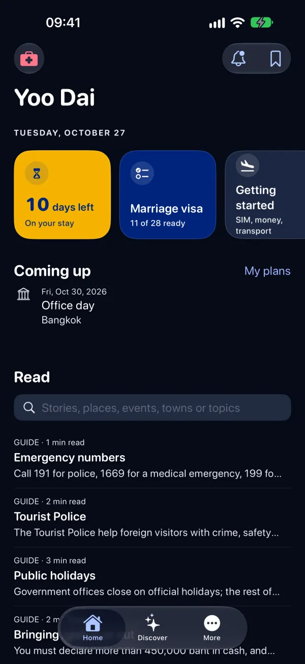
The stay on top, Thailand below
Your stay comes first: 10 days left, with a yellow mark because the stay is getting short, and the marriage visa at 11 of 28 ready. Both cards open the screens behind them.
Below them is the reason to come back: events, places and destinations, each with photos and short videos I publish. Videos never autoplay; you tap to play, which saves mobile data.
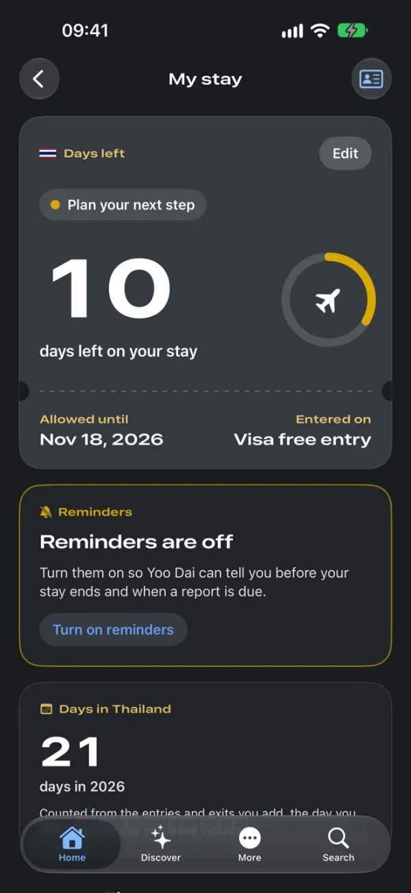
My stay · from the Stay card
One number, and the date behind it
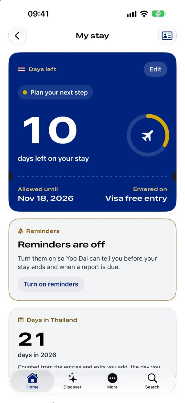
10 days left, allowed until November 18, entered on visa free entry. The ring empties as the stay runs out, and “Plan your next step” appears when it gets short.
Every change to a stay goes through one place, so a finished trip, an approved extension or a refusal all update the stamp and the plan together. The Watch shows the same count, and days in Thailand this year.
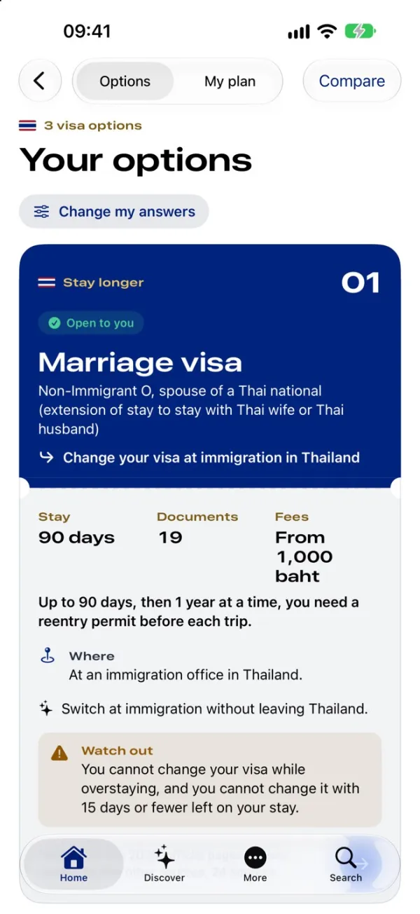
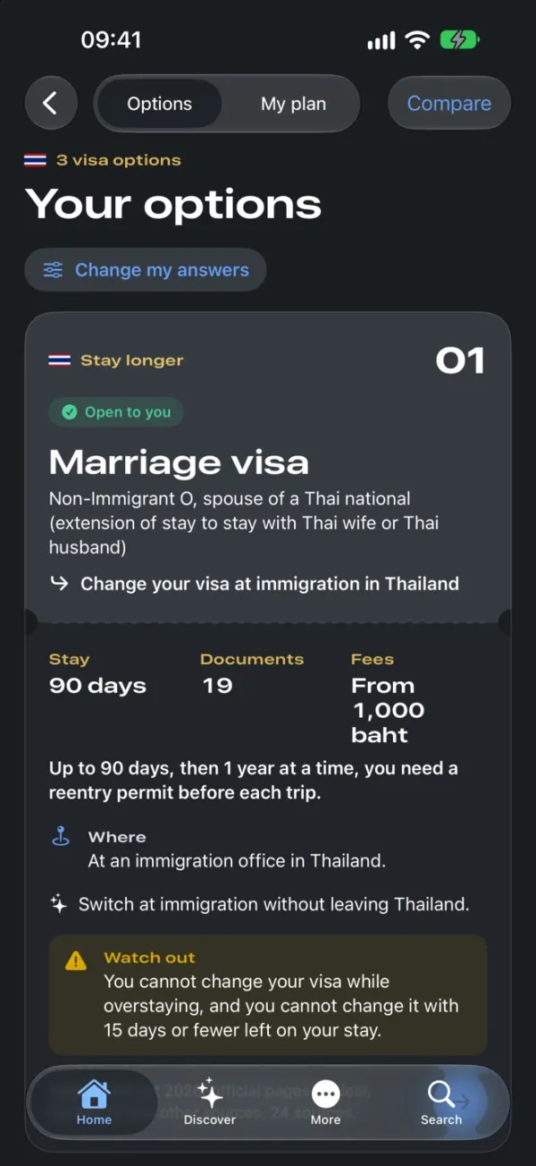
Your options · after a few questions
Visas that may fit, ranked, with the catch
A few questions about why you’re here and how long you want to stay. Yoo Dai ranks the visas that may fit, each with the stay it gives, the documents, the fees and the office to go to.
Each option says what to watch out for, like not being able to change a visa with 15 days or fewer left. Compare sets them side by side in a real table.
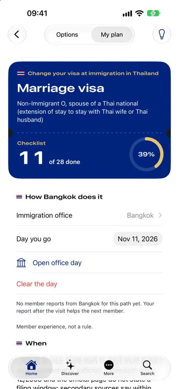
My plan · the marriage visa
A checklist to the counter
Pick a visa and it becomes a plan: 11 of 28 done, the immigration office and the day you go.
How Bangkok does it sits apart from the rules, marked “Member experience, not a rule”. What members report after a visit helps the next person, but it never reads as the law.
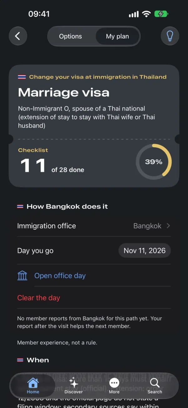
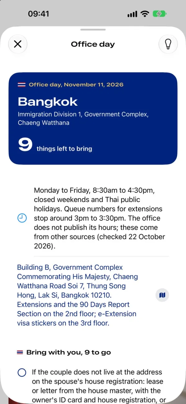
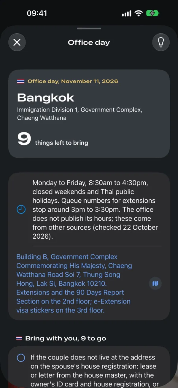
Office day · November 11
Everything for the day, on one screen
The office, its hours, the building and floor, and what’s still left to bring. Where an office doesn’t publish its hours, the screen says where they came from and when they were checked.
On the day, a Live Activity keeps the office and the count of things to bring on the Lock Screen.
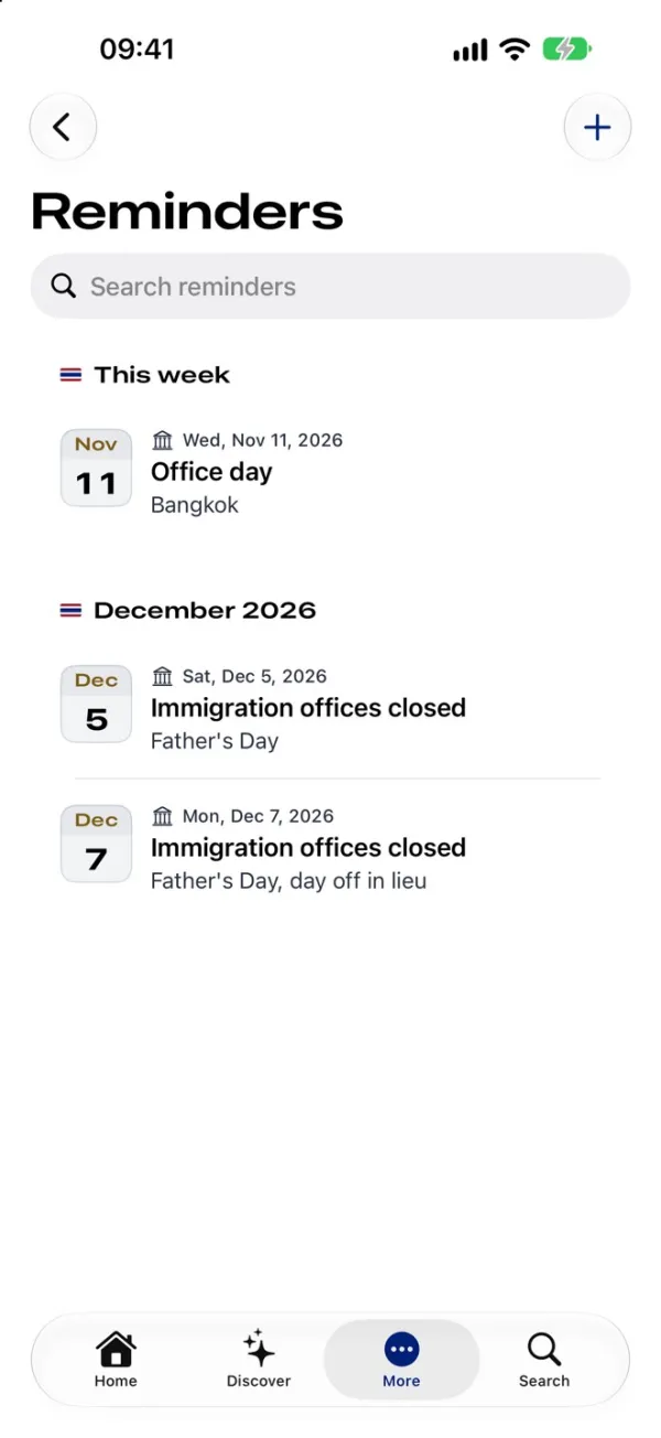
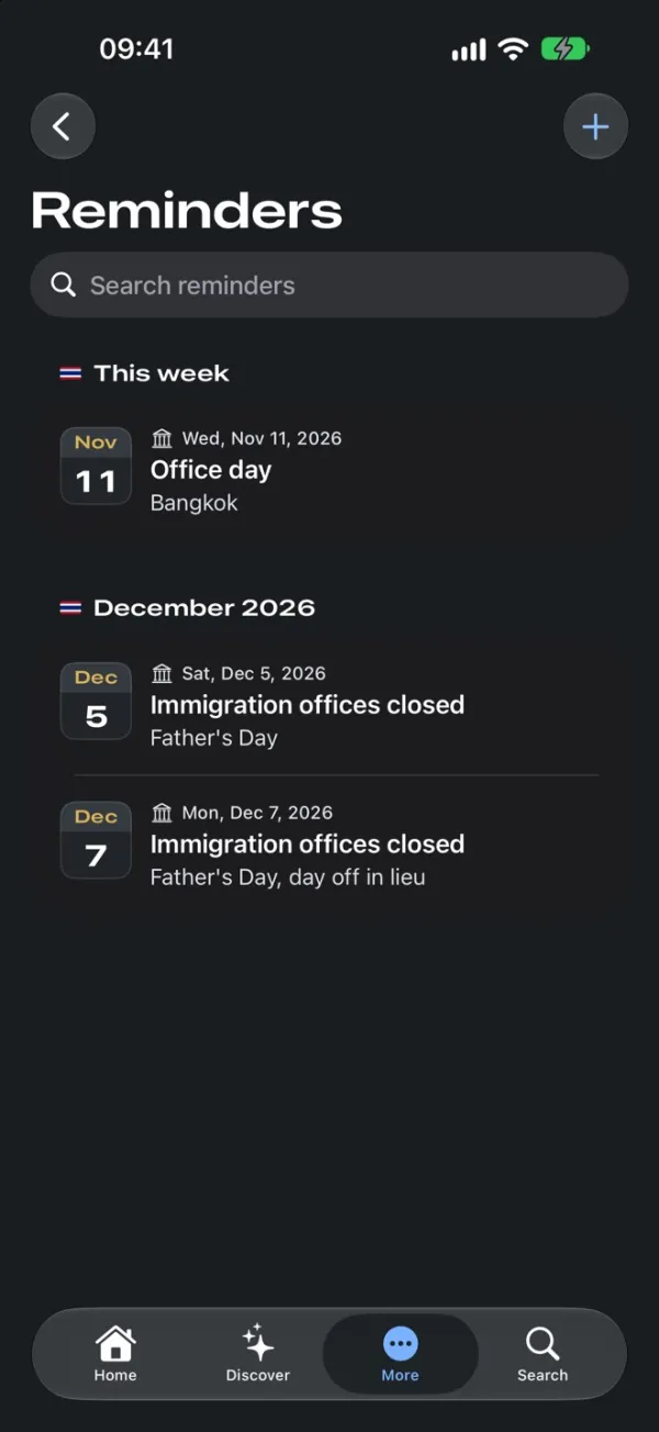
Reminders · by month
The dates that change a plan
The office day, then the public holidays when immigration offices are closed, grouped under month headings. A holiday right before an office day is the kind of thing people find out at a locked door.
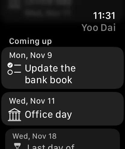
The Watch shows what’s coming up, from today’s task to the last day of the stay.
Discover · what’s on in Thailand
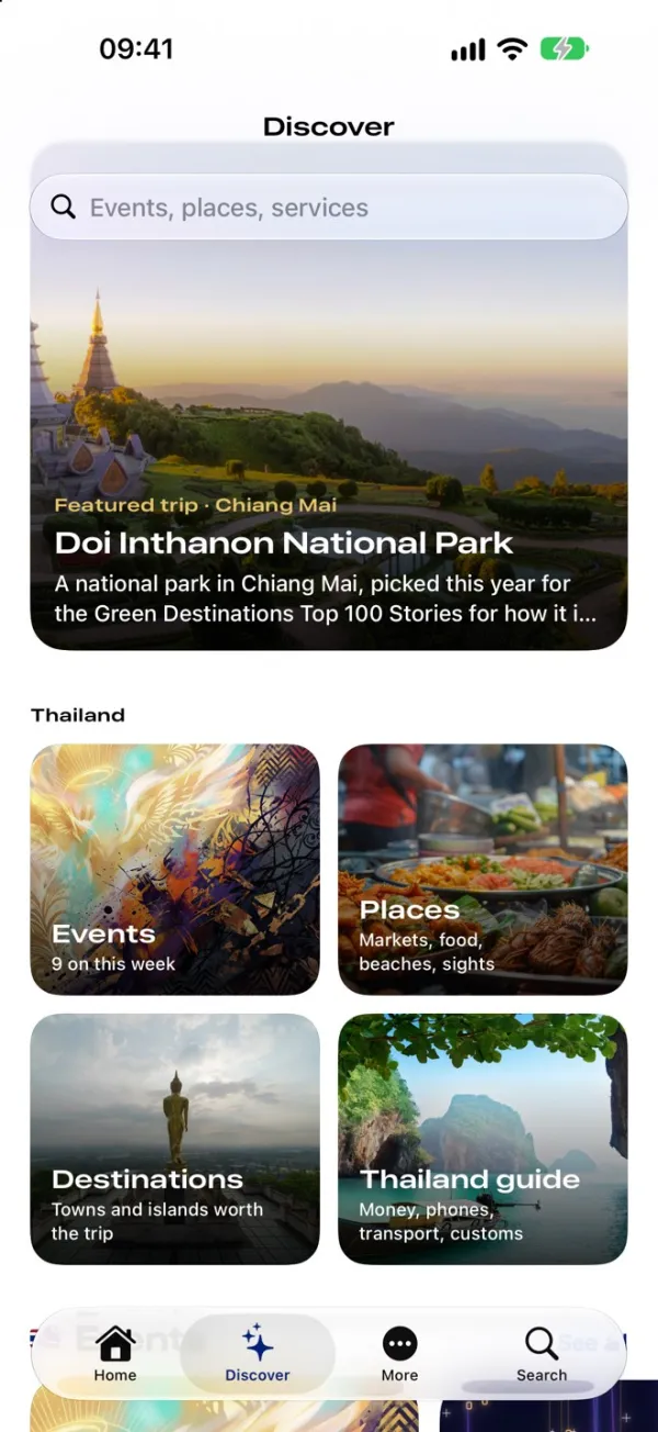
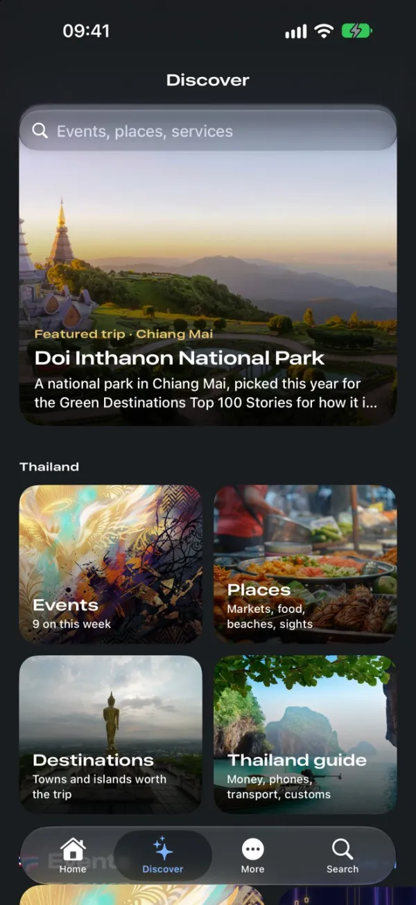
A place to come back to
A featured trip, then events, places, destinations and a Thailand guide for money, phones, transport and customs. Each item has several photos and short videos, swiped sideways.
I write and publish all of it from Yoo Dai Publish, my own web tool, so new content reaches phones without an app update.
Events
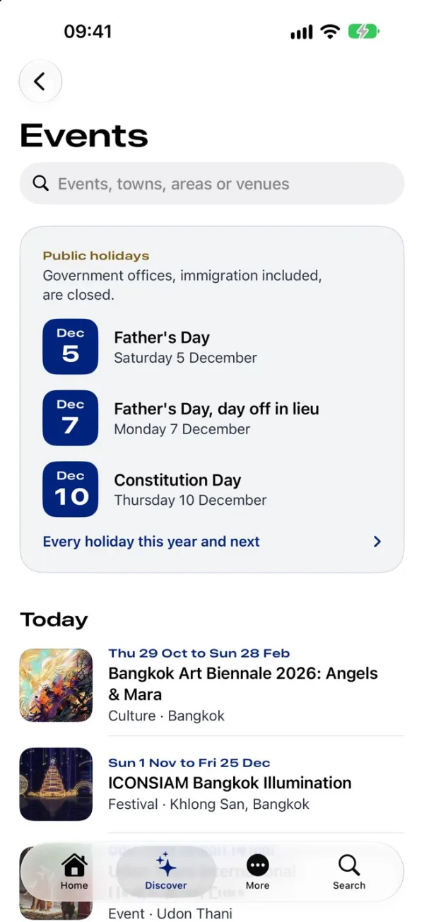
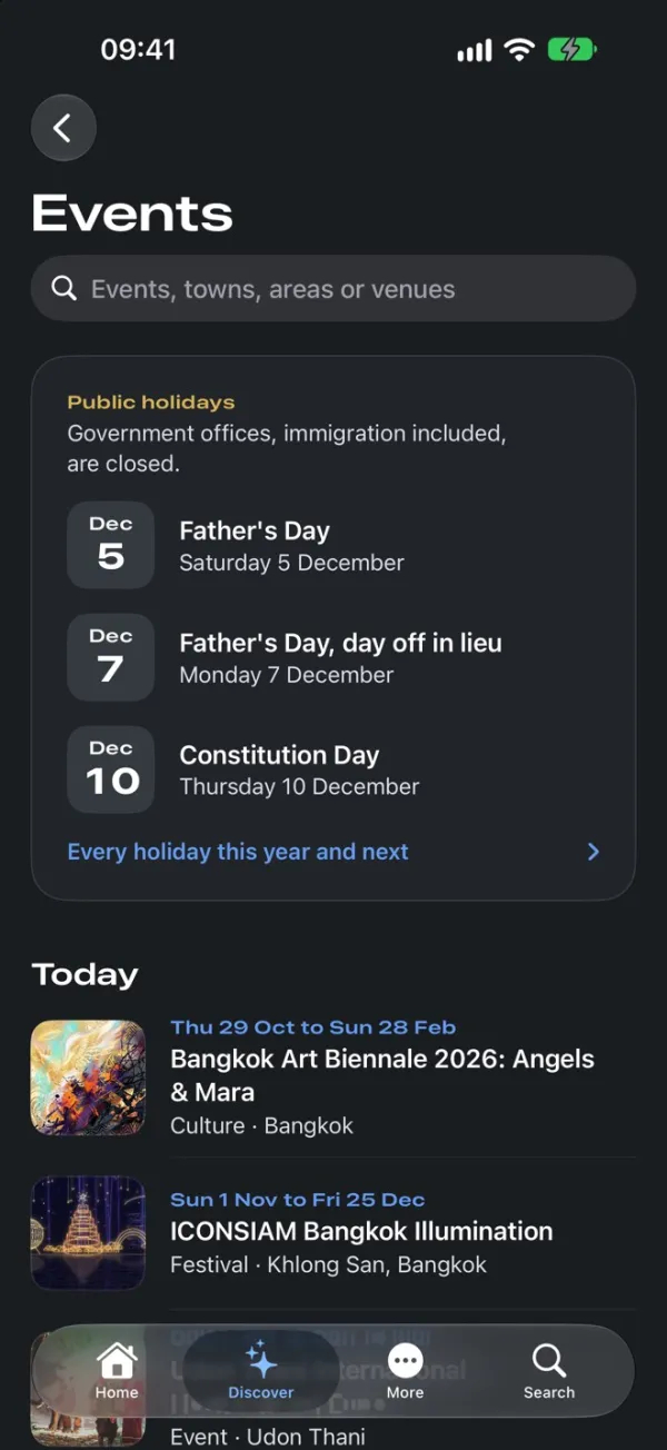
Holidays before festivals
Events open on the public holidays, because government offices, immigration included, are closed on them. Then what’s on today, with dates, the kind of event and the area.
Around version 1.0.1 there were 39 events, 12 places, 4 destinations and 5 posts published, nearly all with my own photos and videos.
A rulebook, not prose
The visa rules live in data files, each rule with a source id and a checked on date. A script assembles and checks them before a build.
One search for everything
Screens, settings, visas, offices, news, the guide, reminders, documents, events and places. Results as you type, best first, in the words people use.
Everywhere it lives
A Home Screen widget, a Lock Screen Live Activity on office day and the Watch, all drawn like Home’s Stay tile: yellow when the stay gets short, red when it’s almost over.
Checked for access
44 point targets, deleting asks first, impossible dates can’t be picked, and swiping a sheet away never throws out typing. Reduce Motion skips the intro.
What App Review and testing changed
From the first commit on October 22 to the resubmission on November 8, 2026.
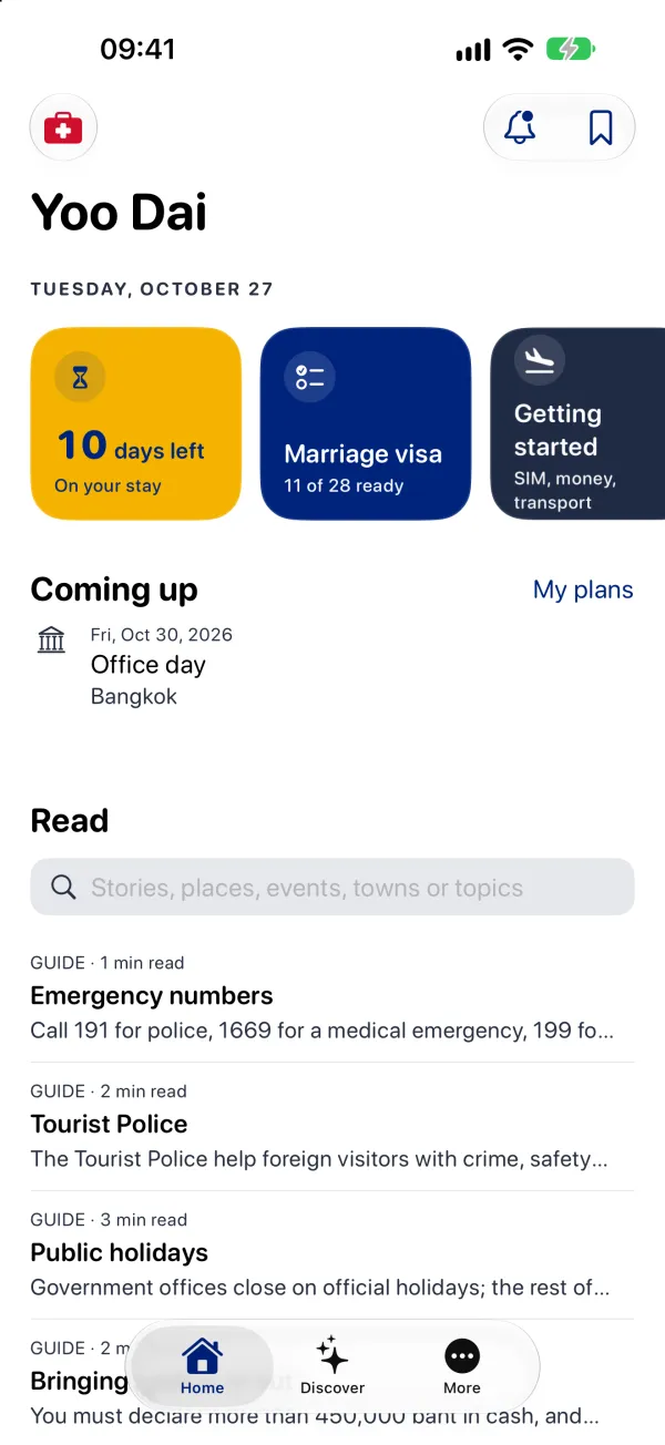
Version 1.0, October 28. A form-like utility in navy.
Version 1.0.1, November 8. Led by photos.
| Problem | What changed | Why it mattered |
|---|---|---|
| Rejected: the reviewer couldn’t find the purchases | The way in named in the review notes, a card on Home, only shows when a member tip is published, and none was. The notes now lead with More, Join Yoo Dai, which always shows. | A correct app still failed review. The fix was the way in, not the code. |
| Rejected: no Terms of Use on the membership screen | Each plan’s name, length and price, with Terms and Privacy links, pinned at the bottom of the sheet. | A subscription screen has to say exactly what someone is paying for. |
| Tracking was buried behind the visa flow | Tracking comes first, screens got plainer, capitals went, and “Immigration officers decide” replaced a disclaimer on every screen. | Most people want the countdown first. The visa flow is for when they need it. |
| Items looked thin, often with no photo | Several photos and short videos per item, tap to play, with upload, reorder and a phone preview in the Publish tool. | The content has to sell the membership. |
| 1.0 felt like a form | A bold, photo led look: Expanded titles, temple gold labels, Thai blue for the main button, red only for emergencies, and a dark mode in near blacks instead of navy. | Opening on discovery needed a design worth coming back to. |
| The widget, Live Activity and Watch wore the old design | All three redrawn as Home’s Stay tile, with the same yellow and red marks. | One system from the iPhone to the Lock Screen and the wrist. |
What success would mean: nobody who uses it overstays
Yoo Dai isn’t on the App Store yet, so there are no results from people using it yet.
It was tested on TestFlight by people living in Thailand. Version 1.0.1 passed 336 tests on build 24 and was resubmitted on November 8.
What I’d test first
The reviewer’s path, on a fresh install with nothing published.
The app was right, and it still failed review, because the way to the purchases depended on live content. I’d walk the review notes the way a stranger would before submitting, not after.
More case studies
Three more apps for everyday life: medicines on time, stock tips scored against the market, and paying by QR code while traveling without paying a fake one.