The interaction layer: how software feels
Interaction design isn't decoration on top of a product. It is the product, experienced in time.
A button is not a button. It's a promise: that something will happen, that you'll know it happened, and that you can take it back. Visual design decides what an interface looks like; interaction design decides what it's like to use, the feedback after a tap, the half-second that decides whether an app feels alive or broken, the difference between a confirmation dialog and a quiet undo. This is a working masterclass: seven principles, each one grounded in established human-computer-interaction law and proven with a demo you can run right here on the page. No screenshots of other people's apps. Every example is rebuilt so you can click it, break it, and feel the principle for yourself.
The whole masterclass · one living surface
Not slides. A working interface. Open a pattern and it morphs into a live detail you can actually use. Every principle in this case study is firing in this one piece, hand-built, no animation library. Try ⌘K.
Open a tile and watch it grow from exactly where it sat (a shared-element transition). Inside: drag the puck and feel the spring, publish optimistically and undo, or disclose options on key. Flip reduced motion from the palette and every morph degrades to an instant, legible state change.
Principle 01
Every action gets an answer
Feedback & system status
An interface that takes an action and says nothing isn't quiet. It's broken, as far as the person can tell.
The first job of any interaction is to confirm it happened. Press registers, work-in-progress shows, success lands, failure explains. When that loop is missing, people do the only rational thing: they tap again. Double orders, duplicate messages, and "is it frozen?" rage-clicks are not user error. They're the absence of feedback.
In the wild: the most-praised "delightful" apps are usually just relentlessly responsive ones. The satisfying check-off in a task manager, the live cursors that make a shared canvas feel inhabited, the keystroke that paints a character the instant you press it. None of these are features. They're feedback, designed with care.
Live demo · click both. Only one tells you anything.
A button that does the work but never says so. Did it add? Click again to be sure.
Cart: 0
Press state → "Adding…" → "Added ✓", announced to screen readers. Locked while in flight.
Cart: 0
Notice how the left button invites a second, third, fourth click, every one a potential duplicate. The right one removes all doubt, so you click exactly once.
The press acknowledgement is a 120ms scale to 0.86 and back, fast enough to read as “heard you,” too fast to delay the result.
Principle 02
Speed is a feeling, not a benchmark
Perceived performance & latency
The question isn't "how fast is it?" It's "how fast does it feel?", and those are designed separately.
A network round-trip takes as long as it takes. What you control is the gap between the person's action and the interface's response to it. Show the result immediately and reconcile with the server in the background (optimistic UI) and a 600ms request feels instant. Make people stare at a spinner for the same 600ms and the app feels sluggish. Same latency; opposite experience.
In the wild: sometimes the right move is to add delay on purpose. Gmail's "Undo Send" holds your message for a configurable 5, 10, 20, or 30 seconds before it actually leaves, trading a sliver of latency for a recoverable mistake. Perceived performance is about spending time where it buys something.
Live demo · add a few tasks each way. Watch the wait.
In "wait" mode the task only appears after the round-trip, you sit and watch. In optimistic mode it appears the instant you hit Enter, marked "saving," and quietly confirms. The optimistic version is not faster; it just respects your attention.
Optimistic content eases in over 220ms on a decelerate curve; its exit runs shorter (~150ms). That asymmetry makes arrivals feel earned and dismissals feel instant.
Principle 03
Make the possible obvious
Affordances & signifiers
A capability nobody can see might as well not exist.
Don Norman draws the line that every interaction designer lives on: an affordance is what an object makes possible; a signifier is the perceivable cue that tells you so. A draggable card affords dragging, but only the grip dots, the cursor change, and the lift on hover signify it. Designers almost never need more affordances. They need better signifiers for the ones already there.
In the wild: pull-to-refresh, invented by Loren Brichter in the Tweetie app (it earned him an Apple Design Award in 2009; the gesture was later patented in 2013) works because of its signifier. The list stretches elastically as you pull, telling you something will happen if you let go. The affordance is "you can refresh." The stretch is what makes it discoverable.
Live demo · same affordance, with and without its signifier
With signifiers off, the rows look inert, the drag capability is invisible. Flip them on and the grip, the grab cursor, and the hover lift announce "pick me up." Nothing about what's possible changed; only what's perceivable did.
On hover the handle lifts 5px in 120ms, motion becomes the signifier, promising “grabbable” before you ever touch it.
Principle 04
Prefer undo to "Are you sure?"
Forgiveness & reversibility
A confirmation dialog taxes everyone, every time, to guard against the rare mistake. Undo taxes only the person who actually erred.
Confirmations feel safe, so they multiply, until people click "Yes" reflexively without reading, and the dialog protects no one. The more humane pattern is to act immediately, then offer a brief, frictionless way back. Make the common path free and the recovery cheap, and you get both speed and safety instead of trading one for the other.
In the wild: Gmail's "Undo Send" is reversibility as a headline feature, your message is recoverable for a chosen 5 to 30 seconds. The undo toast that appears after you archive or delete is the same idea: act now, repent cheaply. The keyboard's most universal promise, Cmd/Ctrl-Z, is this principle compressed to a reflex.
Live demo · delete the same inbox two ways. Feel the friction.
"Confirm" makes you stop and answer a question for every deletion, including the 95% you meant. "Delete + undo" lets all of them fly and only interrupts the one you regret. Count your clicks in each mode.
The undo snackbar rises 16px as it fades in over 220ms, then leaves in 160ms, long enough to catch the eye, gone before it nags.
Principle 05
Show what's needed; keep power one step away
Progressive disclosure & density
Complexity is conserved, your job is to decide who carries it, and when.
Cram every option onto the surface and novices drown; hide everything behind menus and experts grind. Progressive disclosure resolves the tension: present the few things most people need now, and put the long tail of power one deliberate step away. The command palette is the purest expression, a near-empty surface that contains the entire app, summoned by a keystroke and narrowed by typing.
In the wild: the command palette began life in code editors and has since become the connective tissue of modern productivity apps, one shortcut (commonly ⌘K / Ctrl-K) that reveals every action without permanently spending screen space on any of them.
Live demo · press the button or ⌘/Ctrl + K
Project workspace
A clean surface. Everything else is one keystroke away.
No command run yet.
Type to filter, ↑↓ to move, Enter to run, Esc to close. The whole app is reachable, yet the resting surface stays calm.
The command palette scales 0.96→1 while fading in over 220ms on a decelerate curve, it grows toward you from its trigger instead of just appearing.
Principle 06
Let people act on the thing itself
Direct manipulation & spatial consistency
Drag the card. Don't open a "move card" dialog and type a position number.
Direct manipulation means the object you care about is right there, visible and grabbable, and your action changes it continuously and reversibly. The payoff isn't only ergonomic, it's cognitive: when things stay where you left them and respond to your hands, the interface becomes a place you build a mental map of, instead of a form you fill out.
In the wild: a design canvas where you drag a shape rather than edit its coordinates; a board where you drag a card between columns; a list you reorder by hauling rows up and down. And the quiet partner to all of it, spatial consistency: nav, controls, and items that don't jump around between visits, so muscle memory can form.
Live demo · drag to reorder, or do it from the keyboard
Drag a row with the mouse, or focus one with Tab, press Space to grab, move with ↑↓, and Space again to drop. Direct manipulation that excludes the keyboard isn't direct for everyone, so this one works both ways and announces each move.
While dragging, the object tracks the pointer 1:1 with zero lag; on release a stiffness 300 / damping 22 spring carries it home, direct now, physical on let-go.
Principle 07
Design the whole spectrum of input
Input modality, accelerators & access
The same action should be reachable by the curious first-timer with a mouse and the expert who never lifts their hands from the keys.
Pointer paths are discoverable; keyboard paths are fast. The mistake is treating them as rivals. Give every meaningful action a visible click target and a keyboard accelerator, surface the shortcut right next to the control so it's learnable, and you serve the novice and the power user with one design. This is also where interaction design and accessibility become the same discipline: a fully keyboard-operable interface with visible focus is both faster for experts and usable by people who can't use a pointer at all.
In the wild: keyboard-first productivity tools win loyal users by making the shortcut the primary interface and the pointer the fallback, never the reverse. And the accessibility throughline runs through every demo on this page: each is operable from the keyboard, announces state to assistive tech via live regions, and honors prefers-reduced-motion.
Live demo · drive this toolbar with the mouse or the keys
Click a button, or hold Alt and tap the highlighted letter while focus is in this card.
No action yet.
The shortcut lives on the button, so the pointer path teaches the keyboard path. Tab through to see the focus ring that makes all of this navigable without a mouse.
The focus ring does not animate between fields, it snaps. Animating focus would lag keyboard users behind their own Tab key; here motion’s job is to get out of the way.
Part two · the motion layer
Interaction design decides what happens. Motion design decides how it feels happening.
The seven principles above settle the logic of an interface: what an action does and how you recover from it. This second arc is about the physics: the milliseconds, curves, and continuity that decide whether that logic feels alive, mechanical, or broken. Six advanced, hand-built demos, no animation library, every one correct under prefers-reduced-motion. Drag them, fling them, interrupt them mid-flight.
Motion 01
Easing is meaning, not decoration
Physics & the feel of time
The same move, played on three different curves, says three different things. One feels dead, one feels fine, one feels alive, and you choose which.
Linear motion is the tell of a computer: nothing in the physical world starts and stops at a constant speed. Eased motion borrows real-world acceleration and feels designed. A spring goes further, it has mass, it overshoots and settles, and because it carries velocity it can be interrupted without looking broken. Duration tweens answer "how long?"; springs answer "how does it move?", and on a touch surface, only the second question has a good answer.
In the wild: Consumer, iOS animates with springs, not fixed durations, which is why a sheet you fling feels like a real object. SaaS, a well-built button squashes a touch on press and overshoots on release, so a flat rectangle suddenly has heft. Same pixels; the curve is the whole difference.
Live demo · play the same trip on three curves, then bend the physics
Linear
cubic-bezier(0,0,1,1)
Eased
cubic-bezier(.2,0,0,1)
Spring (overshoot)
stiffness 220 · damping 18
Watch the pucks finish: linear arrives and stops dead; eased glides to rest; the spring sails past and settles back. Drag the sliders and the spring graph re-plots from the same integrator that drives the puck, lower the damping and watch the overshoot grow.
snappy spring (stiffness 300, damping 30) over a fixed tween: it's interruptible, it self-scales to distance, and the gentle overshoot reads as "responsive" without looking bouncy. Reserve bouncy (low damping) for playful, low-stakes moments only.
Reduced motion: the curves render statically and nothing loops, the lesson is in the graphs, not the wiggle.
Motion 02
Don't cut, carry the object across
Continuity & shared-element transforms
When a small thing opens into a big thing, the small thing should become the big thing, not vanish while a new screen appears in its place.
A hard cut forces the eye to re-find everything and re-learn where it is. A shared-element transition keeps one object continuous across the change: a tapped tile expands: position, size, and corner radius all interpolating into the detail view, so attention rides along instead of resetting. This is the difference between "a new screen loaded" and "I opened this thing." It is the most expensive trick on this page to fake and the cheapest to feel.
In the wild: Consumer, tap a photo in iOS Photos and the thumbnail itself zooms to fill the screen. SaaS, Linear and Notion expand a list row into a detail peek that grows out of the row you clicked, not a panel that slides over it. Same gesture, preserved object.
Live demo · click any tile or row, watch it morph, not cut
Detail
The card you clicked grew into this view, same element, no cut.
The detail view isn't a new element fading in, it's the same card, measured at its grid position (First), placed at its final size (Last), inverted back to where it started, then released. Your eye never loses it. Close it and it shrinks right back to the tile it came from.
320ms on a standard curve, animating only transform + opacity + border-radius (GPU-cheap), with the close transition at ~220ms, the asymmetry makes opening feel deliberate and closing feel quick.
Reduced motion: the detail cross-fades in place (no zoom, no travel) preserving the link without vestibular risk.
Motion 03
Choreograph the entrance
Orchestration, stagger & follow-through
When many things appear at once, the order and the spacing between them is information, it tells the eye how the layout is built.
Reveal a dashboard's cards all at the same instant and the screen "pops", flat, simultaneous, hard to parse. Reveal them in a quick cascade and the eye is led across the structure in reading order; the few-dozen milliseconds between each one is enough to imply hierarchy without anyone consciously noticing. Too much stagger, though, and the load feels slow. There's a sweet spot, and it's tunable.
In the wild: SaaS, analytics dashboards breathe their cards in on load so the page assembles rather than blinks. Consumer, a social feed reveals posts in a quick top-to-bottom cascade. Move the slider below and feel the perception change.
Live demo · replay the reveal, then change the stagger and replay again
At 0 ms the cards snap in together, flat and slightly jarring. Around 40 to 60 ms they cascade with a clear sense of order. Past ~100 ms the entrance starts to feel like waiting. The reveal itself is one shared spring; only each card's start is offset.
~50ms per item with a soft spring, capped so the last item still lands within ~500ms total, past that, trim the per-item delay rather than make people wait for the structure to finish assembling.
Reduced motion: every card appears at once with opacity only, no rise, no stagger, no overshoot.
Motion 04
Never let anything teleport
Layout animation · animate the diff
When a list re-sorts or filters, the rows shouldn't blink into new positions, they should travel to them, so you can follow where your item went.
A sort is a change of state, and an unanimated change of state is a teleport: everything jumps and the user has to re-scan to find the row they were tracking. Animating the diff: measuring every row's old position, applying the new order, then sliding each from old to new, turns a disorienting jump into a legible rearrangement. Filtering is the same: rows that leave fade and the survivors glide up to close the gap.
In the wild: SaaS, re-sort a table in Linear and every row glides to its new slot; Things reorders to-dos the same way. Consumer, reorder a playlist and the tracks slide rather than snap. Sort and filter the table below and watch nothing jump.
Live demo · sort & filter, every row glides to its new home
Each control measures every row's current rectangle (First), re-orders the DOM (Last), inverts each row back to where it was, then releases them all to glide to their new positions. Hide the paused rows and the rest slide up to fill in, your eye keeps its place the whole time.
260ms on a standard curve animating transform only (the DOM is already in its final order, so layout never thrashes); leaving rows fade over ~160ms first so they're gone before the survivors arrive.
Reduced motion: rows reorder and filter instantly, correct final state, zero travel.
Motion 05
Every animation is interruptible
Velocity-aware springs you can grab mid-flight
The signature test of real motion: grab something while it's animating and reverse. Does it fight you and restart, or does it just change its mind, carrying the speed it already had?
A canned tween can't be interrupted gracefully: catch it halfway and it either snaps to its end or restarts from a standstill, both of which feel broken. A spring tracks position and velocity every frame, so handing it a new target mid-flight simply re-aims the force it's already applying, the object continues from exactly where and how fast it was moving. This is what makes an iOS sheet feel like it has real momentum you can throw, catch, and redirect.
In the wild: Consumer, the iOS Control Center / share-sheet you can fling, catch, and reverse. SaaS, a drag-to-resize panel with momentum and detents (snap points at 25 / 50 / 75%). Both below run on the same ~30-line hand-built spring.
Live demo · drag & fling the sheet, then grab it mid-flight and reverse
Now Playing
Fling me up or down. Catch me mid-animation and drag the other way, I keep my momentum and re-target, I don't restart.
Half open.
SaaS variant: drag-to-resize with detents. Drag the divider (or focus it and use ←→); release and it springs to the nearest snap point carrying its velocity.
Sidebar at 50%.
The trick is in the release: the gesture's recent velocity is fed straight into the spring's velocity term, so a fast flick travels farther than a slow drag. Reverse mid-flight and the spring re-aims without ever resetting to zero speed.
snappy spring (stiffness 300, damping 30, mass 1) integrated with semi-implicit Euler on requestAnimationFrame; release velocity is captured from the last few pointer samples and passed to .setTarget() so the same spring re-targets instead of restarting.
Reduced motion: drag still tracks your finger 1:1, but release snaps instantly to the nearest detent, no spring, no overshoot.
Motion 06
Things should come from where they came from
Spatial origin & causality
A menu that grows out of the button you pressed is obviously caused by that press. A menu that fades in dead-center is a non-sequitur.
Motion is the strongest available cue for cause and effect. When a popover scales up from its trigger's corner, its transform-origin pinned to the exact point you clicked, the interface answers "where did this come from?" before you can ask. When a new row flies in from the + button that created it, the connection between action and result is unmistakable. Get the origin wrong and even a beautiful animation feels arbitrary.
In the wild: Consumer, long-press an iOS app icon and the context menu blooms from the icon itself. SaaS, a "+ New" button that flies the freshly created row out from under the cursor. Try both below.
Live demo · open the menu, then create a row from the button
The menu scales up from its top-left corner (right where the button is) so it reads as belonging to that control. New rows start scaled-down and slightly offset toward the button, then settle into place, drawing a visible line from the click to the result.
0.92 → 1 with transform-origin at the trigger, 180ms decelerate; new rows enter on a soft spring from a small offset so the eye traces the path from button to row.
Reduced motion: menu and rows fade in place, the spatial cue drops, but causality stays clear through grouping and proximity.
Motion 07
Act now, reconcile later, visibly
Optimistic motion & latency choreography
Show the result the instant the user acts; then let the motion quietly report whether the server agreed.
This is Principle 2 (perceived performance) given a body. The message flies into place before the network has answered, the action feels instant. Motion then carries the reconciliation: on success it simply settles and stamps a timestamp; on failure it shakes, rolls back, and offers a retry. The animation isn't decoration on the state change, it is how the state change is communicated, including the unhappy path.
In the wild: Consumer, iMessage shows your bubble immediately and re-colors it if it fails to send. SaaS, a task manager drops the new task in instantly and reconciles. Toggle "force failure" below to watch the error choreography.
Live demo · send a few, flip "force failure" to see the rollback
The bubble appears the moment you hit send, marked "sending." On success it settles and timestamps. On failure it shakes once, turns red, and stays (with a retry) instead of silently disappearing. The happy and unhappy paths are choreographed with equal care.
200ms (decelerate); success just fades the "sending" label; failure plays a single ~320ms shake (small, finite, never a loop) plus a color shift to carry the meaning without relying on motion alone.
Reduced motion: the bubble appears without the fly-in, and failure is signalled by color + text only, no shake.
Motion 08
The most advanced motion knows when to stop
Restraint & reduced-motion as first-class craft
For some people, the parallax and zoom that delight everyone else cause real nausea and vertigo. Honoring that isn't a downgrade, it's the senior move.
A reduced-motion mode is not "animations off." It's a parallel choreography: every transform-heavy transition gets a calm equivalent (a cross-fade instead of a zoom, an instant reorder instead of a glide) so the information the motion carried still lands. The flip below controls this entire page, live. Every demo you just used is wired to it. That's the discipline: design the motion, then design its absence with the same care.
In the wild: turn on Reduce Motion in iOS and app-launch zooms become gentle cross-fades system-wide, the same destination, a calmer route. Every demo on this page does the same when you flip the switch.
Live demo · this switch governs the whole page
Reduce motion (whole page)
Motion: full. Synced to your system setting.
Vestibular-risky · large zoom + parallax
Safe swap · opacity cross-fade
With motion full, the left card zooms and drifts, lovely for most, sickening for some. Flip the switch and play it again: the risky transition automatically becomes the same calm cross-fade as the right one. Nothing is lost; the route just got safer.
motionOK() helper reads matchMedia('(prefers-reduced-motion: reduce)') and this toggle; every demo branches on it, and the page root carries data-motion="full|reduced" so even CSS transitions short-circuit. Default follows the OS; the toggle can only ever reduce further, never override a user who asked for calm.
If your system already requests reduced motion, this page started in the reduced state and the switch reflects it.
The throughline
Interaction design is the design of time, feedback, and recovery, carried by motion
Strip away the vocabulary and the seven principles are one idea seen from seven angles. An interface unfolds in time, so every moment needs an answer (feedback), should feel immediate (perceived performance), should advertise what's possible (affordances), should be safe to get wrong (reversibility), should reveal complexity gradually (progressive disclosure), should let you touch the work directly (direct manipulation), and should meet you whatever way you choose to drive it (input). Get these right and people stop noticing the interface at all, which is the highest praise interaction design can earn. And motion is the connective tissue across all seven, the way state changes explain themselves in time: physics that feels real, continuity that preserves context, choreography that guides the eye, and the restraint to hold still when stillness serves the user better.
The seven principles at a glance
…and eight ways motion carries them
See the principles applied
These ideas aren't abstract. They're the load-bearing decisions in the work. Here's where the masterclass shows up in shipped products.
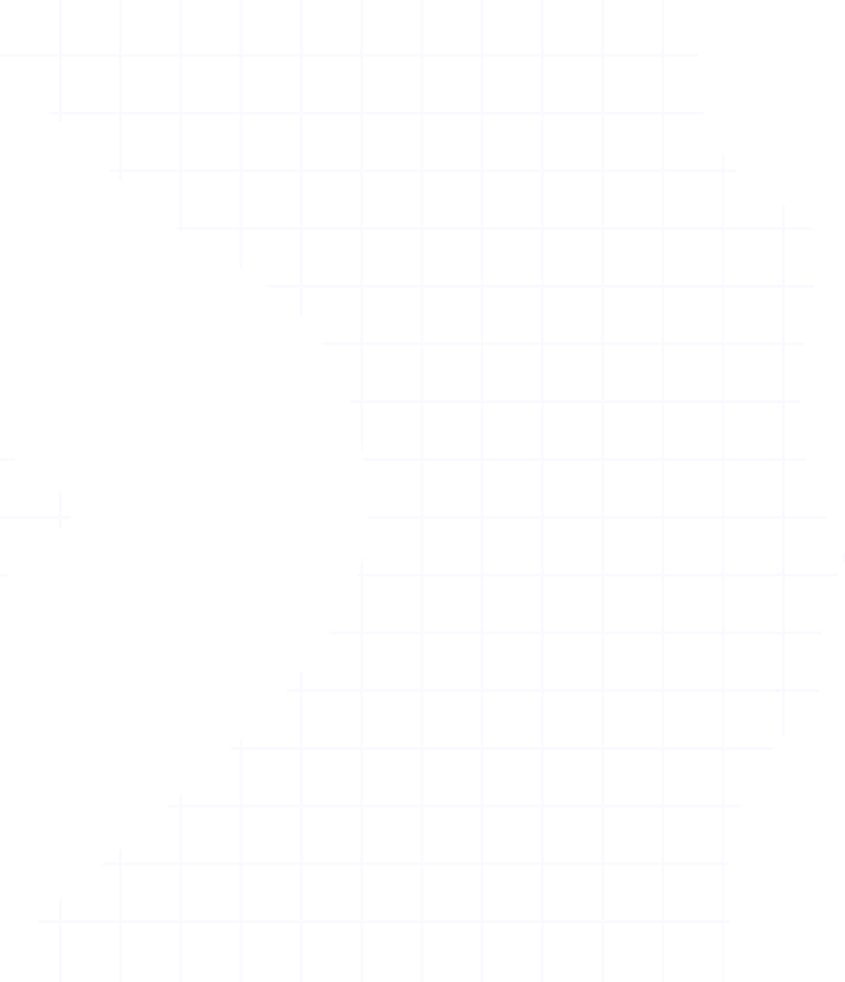
Criterion, feedback & reversibility, applied
A score you can read, challenge, and watch re-evaluate live, visibility of system status and user control turned into the core interaction.
View case study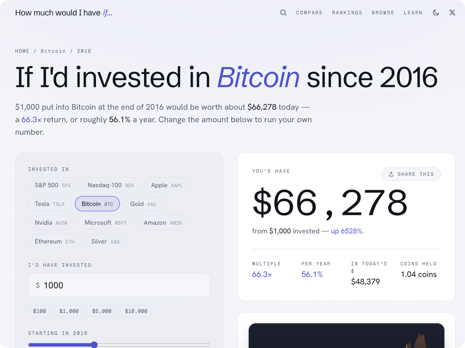
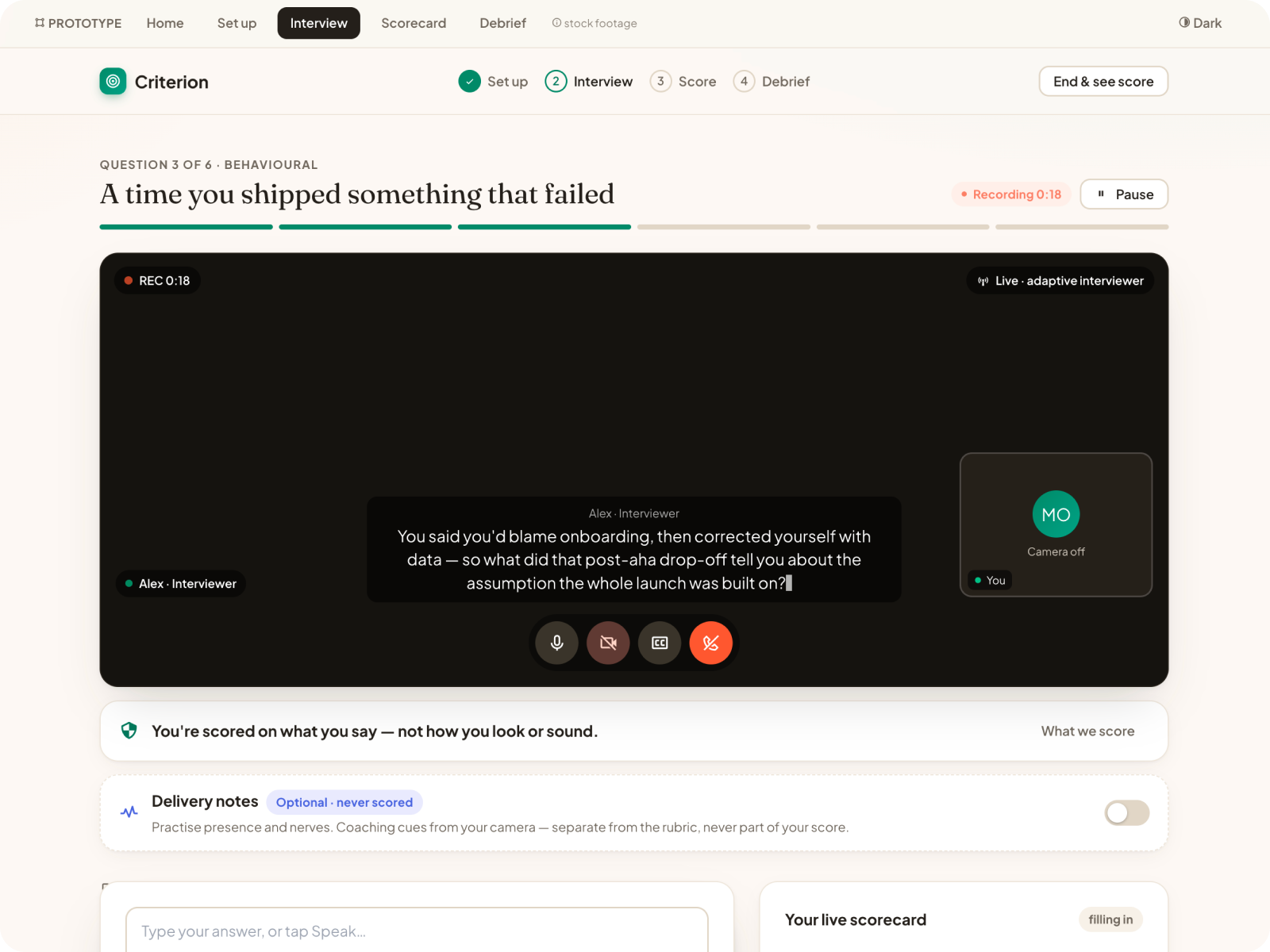
How Much Would I Have If…: direct manipulation
Hand-built, keyboard-accessible SVG charts you can probe directly, with live regions: direct manipulation and input access on a finance surface.
View case study
Signal Inbox, progressive disclosure
Triaging noise into signal is an exercise in showing the right thing at the right moment and keeping the rest a step away.
View case study